สัปดาห์นี้แอดทอยมีสอน 4 ส่วนครับ หัวข้อใหญ่ๆ ตามนี้เลยครับ
แนะนำ replit.com
replit เหมือนสมัยสักปี 2016 / 2017 เป็น IDE Online เคยเล็กอยู่ช่วงนีง ในสมัย replit.it แล้วก็ลืมไป ผมเพิ่งจำได้ว่าเคยใช้ เพราะ วันนี้แหละลอง Login แล้วได้เลย
ตอนนี้เป็น IDE ที่สมบรูณ์แบบลองเขียน Code ได้เลย และมี AI ด้วยนะ แบบพวก GitHub Copilot เลย
Recap Command Line (Linux Base)
pwd- บอก path ที่อยู่ตอนนี้ls- list ข้อมูลใน path ที่อยู่ls -alist all file include hiddenls -llist file with log information such as owner / permissionls -la- combination option
mkdir [your_dir_name]- create dirrmdir [your_dir_name]- remove dirctrl+l- clear screen (ใช้ได้เกือบทุกเจ้า แต่บางเจ้าก็ไม่ได้น้า)
touch [your_file_name.you_extension]- create new filecat [your_file_name.you_extension]- read view file cat from concatenate- rm [your_dir_name / your_file_name.you_extension] - remove file / dir
rm [your_dir_name] -r- remove file and directory recursiveecho "type you message"- show message on terminalcd [your_path]- เปลี่ยน Folder ที่ทำงานปัจจุบันcd ..- ถอย folder ไป 1 step
echo "my word into animal" >> animal.txt- create txt file name animal.txtecho "-hippo" >> animal.txt- append data in text file
wc [your_file_name.you_extension]- count word in file
 2  6 28 animal.txt
Note
 2 line
 6 word
 28 byte
Data Visualization with R
สำหรับตอนนี้สามารถดู Blog R + Data Transformation ได้นะ
- Why we need data viz ?
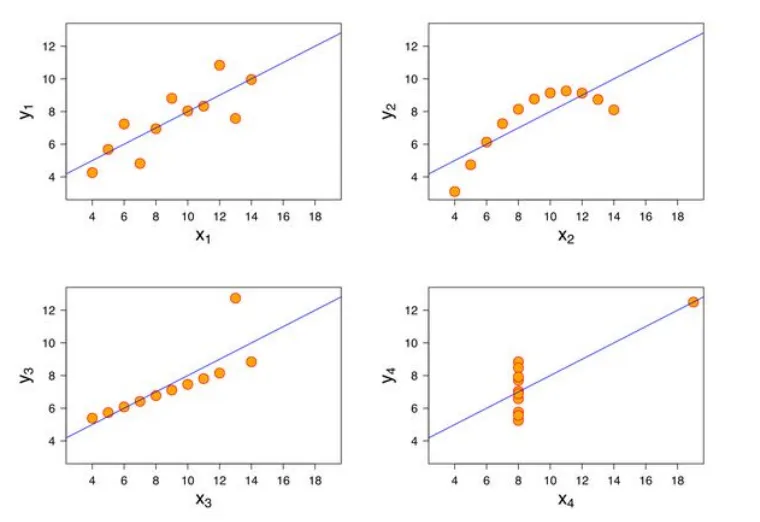
- เอาหาความสัมพันธ์ของข้อมูล 2 ชุด ถ้าดูตัวเลขเพียวๆ มันจะไม่เห็น ถ้าเอามาทำเป็น Chart อย่าง Scatter Plot มันจะช่วยเราเห็น Trend ได้
- สถิตพื้นฐานมันอาจจะหลอกเราได้ เช่น พวก mean / sd / correclation บางที เรามี DataSet หลายตัว พอได้ค่าเหมือนกัน เราอาจจะมองข้ามไป แต่จริงๆ มันมีความลับซ่อนอยู่ เช่น Trend ที่ไม่เหมือนกัน
- เกณฑ์การเลือก Data Visualization / Charts
ปกติมีกราฟหลายแบบ การเลือกใช้ Visualization แอดทอย แนะนำเกณฑ์ไว้ ดังนี้
- จำนวนตัวแปร (Variable) 1 / 2 หรือ มากกว่านั้น
- ชนิดข้อมูล (Data Type) ของแต่ตัวแปร ว่าแบบไหน
- บอกปริมาณ ตัวเลข มีหลายชื่อเรียก numeric / continuous
- บอกกลุ่ม ไม่ว่าจะเป็นตัวเลข หรือตัวหนังสือ มีหลายชื่อเรียก factor / category/ discrete พวก Date วันที่นับเป็นกล่มนี้นะ
สำหรับ Lib ที่ใช้แสดงผลจะเป็นตัว ggplot2 โดยที่ 2 บอกว่าทำ 2D ได้นะ ggplot = Grammar of Graphic Plot ก่อนจะใช้ ggplot เราต้องรู้
- data - dataset ของข้อมูลที่เราจะ plot พวก data frame
- mapping - ตัวบอกว่า เราจะเอาข้อมูลใน data มาใส่ในส่วนไหนของ chart เช่น อะไรเป็น แกน x / y หรือ การกำหนดสีให้ Dynamic เป็นต้น
- geometry - รูปแบบการแสดงผลว่าจะใช้ chart แบบไหน point / line chart etc. โดยทำได้ทั้ง
- mapping - dynamic ตามข้อมูล
- setting - บอกไปเลยอยากได้แบบไหน
โพยสรุปย่อ https://rstudio.github.io/cheatsheets/data-visualization.pdf
- Histogram (1 Variable / numeric)
บอกการกระจายของข้อมูล
ggplot(data=diamonds ,
       mapping = aes(x=price)) +
         geom_histogram()
ตรงนี้จะเห็นว่า เราใส่ทั้ง data mapping และเรียกใช้ geometry โดยในส่วน data กับ mapping ยังสามารถทำเป็น Predefine ได้ ว่าจะเอาไปแสดงผลแบบไหน
# refactor
# base config
base <- ggplot(data=diamonds ,
               mapping = aes(x=price))

# use base config to create histogram
# -> bins for split data in each column default 30
# -> Note bins is an  example of setting override mapping
base + geom_histogram(bins = 10)
base + geom_histogram(bins = 150, fill="red", color="black")

# use base config to create density
base + geom_density()

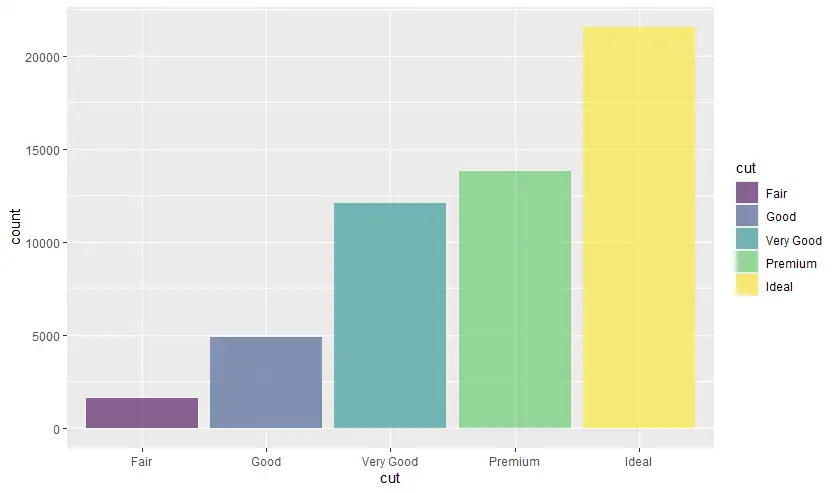
- bar (1 Variable / factor)
bar chart - เอาจำนวนของแต่ละกลุ่มมาเทียบกัน
นอกจากนี้ ggplot2 ใน geometry เกือบทุก Type มี property
- fill - เติมสี
- color - เติมเส้นขอบ
- alpha - บอกความโปร่งแสง
ggplot(data=diamonds,
       mapping = aes(x=clarity)) +
        geom_bar(fill="gold", color="black", alpha=0.30)

ggplot(data=diamonds,
       mapping = aes(x=cut)) +
  geom_bar(fill="gold", color="black", alpha=0.30)
- set color of each bar dynamic from data frame
# set color of each bar dynamic from data frame
base2 <- ggplot(data=diamonds,
          mapping = aes(x=cut))
base2 +
  geom_bar(mapping = aes(fill = cut), alpha=0.60)
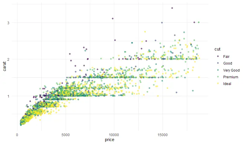
- scatter plot (2 Variable / numeric กับ numeric)
scatter plot เอาตัวเลข 2 ชุดมา plot หา Trend / หาความสัมพันธ์ของข้อมูล Correlation
ggplot(data=diamonds,
       mapping = aes(x=price, y=carat)) +
        geom_point()
over plotting problems ปัญหามีข้อมูล Data Point มาเกินไปจนเราไม่เห็น Trend / Correlation มีแต่จุดละเลงไปหมด อันนีต้องแก้ปัญหา โดย sampling ข้อมูล ตรงนี้เอาที่แอดทอยสอนจากสัปดาห์ที่แล้วมาแล้ว โดยการ sampling มีข้อจำกัด มันจะสุ่มไปเรียยๆ ถ้าอยากให้ผลเหมือนกัน ให้กำหนด seed set.seed(your_magic_number)
# now you will face with over plotting
# small data with sample
# ggplot set alpha +  shape

set.seed(42) # fix random sample
small_diamonds <- diamonds|> sample_n(5000)

ggplot(data=small_diamonds,
       mapping = aes(x=price, y=carat)) +
  geom_point()

ggplot(data=small_diamonds,
       mapping = aes(x=price, y=carat)) +
  geom_point(alpha=0.50, shape = "+")

ggplot(data=small_diamonds,
       mapping = aes(x=price, y=carat)) +
  geom_point(mapping = aes(color = cut), alpha=0.50) +
  theme_minimal()
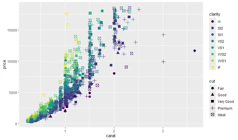
นอกจากนี้ scatter plot หลักๆ ทำ 2 ตัวแปรก็จริง แต่มันใช้มากกว่า 2 ตัวแปรได้นะ
# ggolot2: 2D
# add more than 2 variable
# map aes more

ggplot(diamonds,
       aes(x=carat, y=price)) +
  geom_point(aes(color=clarity))

ggplot(diamonds |> sample_n(1500),
       aes(x=carat, y=price)) +
  geom_point(aes(color=clarity
               , shape = clarity))

# map with 4 variable carat / price / clarity / cut
ggplot(diamonds |> sample_n(1500),
       aes(x=carat, y=price)) +
  geom_point(aes(color=clarity
                 , shape = cut), size = 3)
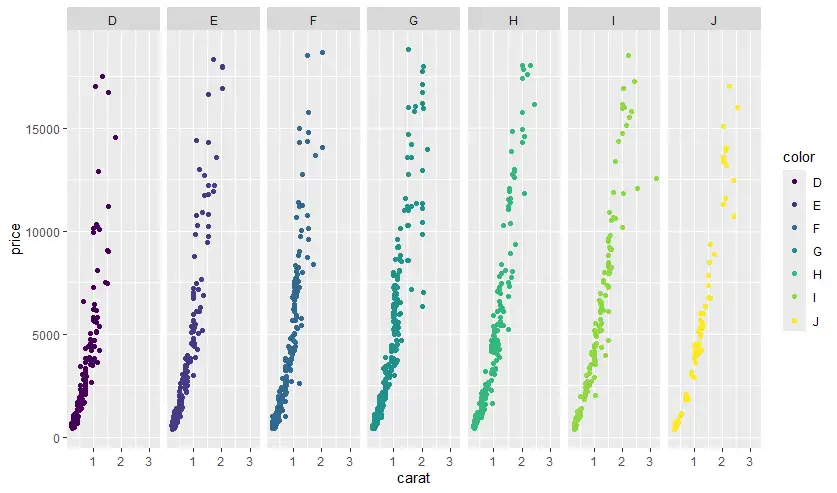
- faceting
ถ้า chart มันซับซ้อนสีสันเต็มไปหมด เราสามารถแยกออกมาเป็น subset ย่อยๆ ตาม factor ออกมาเพื่อให้ดูง่ายๆ break big chart into small multiple
- facet_wrap สำหรับ subset 1 variable
# facet_wrap only 1 var

ggplot(diamonds |> sample_n(1500),
       aes(x=carat, y=price)) +
  geom_point() +
  facet_wrap(~cut)

ggplot(diamonds |> sample_n(1500),
       aes(x=carat, y=price)) +
  geom_point(aes(color=color)) +
  facet_wrap(~color, ncol=7)
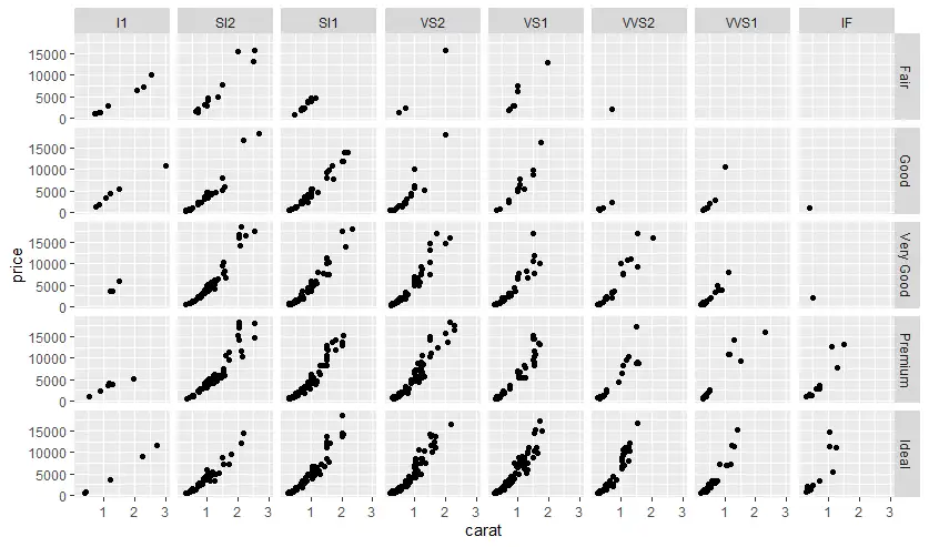
- facet_grid สำหรับ subset 2 variable
# facet_grid 2 var
ggplot(diamonds |> sample_n(1500),
       aes(x=carat, y=price)) +
  geom_point() +
  facet_grid(cut ~ clarity)
- dplyr (Data Transformation) + ggplot
ก่อนที่จะเอา Data มาแปลงผล เราสามารถ ทำ Data Transformation และส่งให้ ggplot แสดง Data Visualization ขึ้นมาได้ และพอมันอยู่กลุ่ม TidyVerse มันสามารถใช้ pipe ( |> หรือ %>%) ทำงานให้่มันเป็น Chain ต่อกันได้
diamonds |>
  filter(carat >= 0.5,
         price >= 4000,
         cut == "Ideal") |>
  count(clarity) |>
  ggplot(aes(clarity,n)) +
  geom_col()
หรือ อีกแบบ
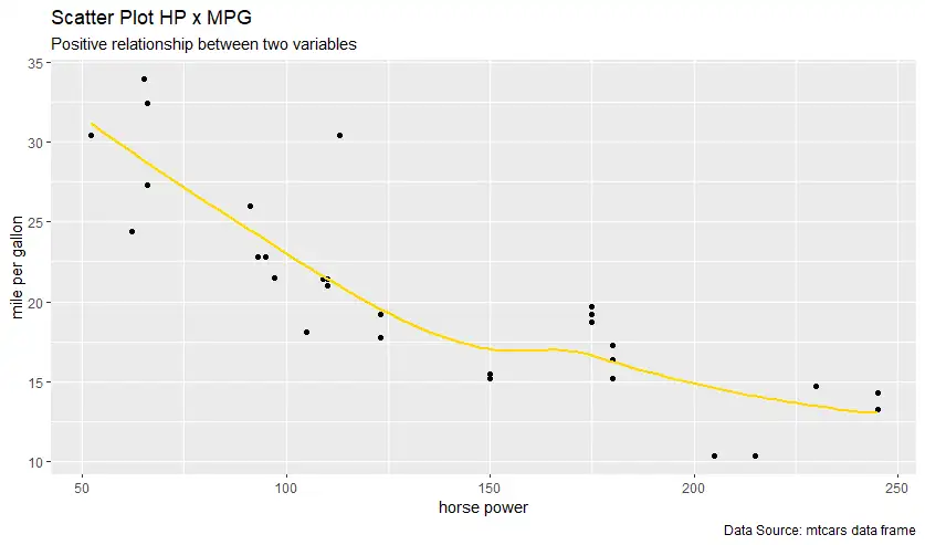
mtcars |>
  filter(hp < 250) |>
  ggplot(aes(hp,mpg)) +
    geom_point() +
    geom_smooth(method="loess",
                se = F,
                color = "gold",
                fill = "red" ) +
    labs(title = "Scatter Plot HP x MPG",
         subtitle = "Positive relationship between two variables",
         caption = "Data Source: mtcars data frame",
         x = "horse power",
         y = "mile per gallon")
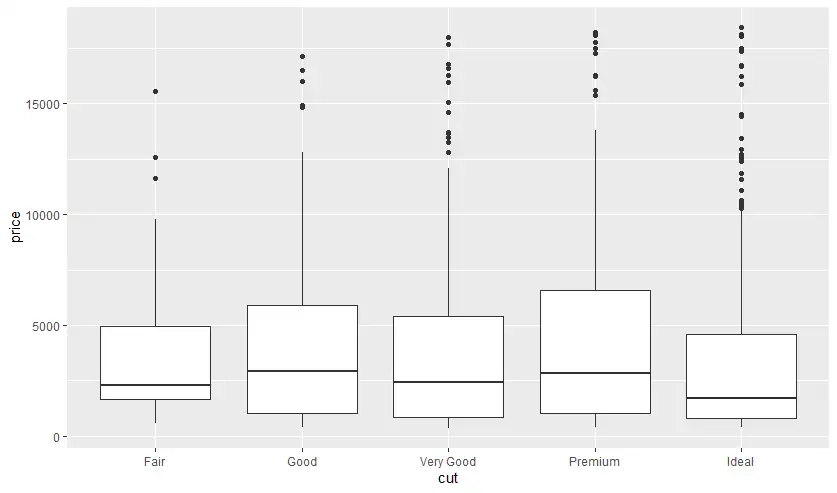
- Box Plot - detect outliner + summary data
outliner + summary data ดูตามรูปภาพจาก base r
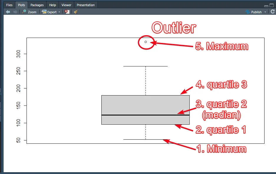
ggplot(diamonds |> sample_n(1000), aes(price)) +
  geom_boxplot()
นอกจากนี้ ยังเอาอีกตัวแปร มา Cross เพิ่มดูข้อมูลแยกตามกลุ่มได้ แบบ faceting
ggplot(diamonds |> sample_n(1000)
       , aes(x=cut, y=price)) +
  geom_boxplot()
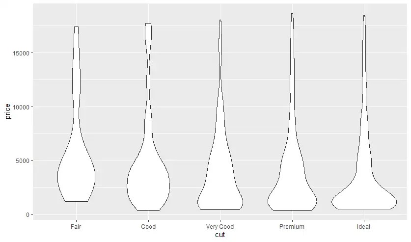
- Violin Plot - Box Plot + histogram
อันนี้เพิ่งเคยได้ยินครั้งแรก มันดูเหมาะกับการตรวจข้อมูลไวยังไงไม่รู้
## Violin Plot - Box Plot + histogram
ggplot(diamonds |> sample_n(1000)
       , aes(x=cut, y=price)) +
  geom_violin()

ggplot(diamonds |> sample_n(1000)
       , aes(price)) +
  geom_histogram(aes(fill=cut), alpha=0.4)

- Multiple Data Set
ตัว ggplot รองรับการเอาข้อมูลหลายแหล่ง หลาย Data Frame มา plot ได้นะ แต่ต้องไปกำหนด mapping ในส่วน geometry แทน โดยข้อมูลที่เอามาควรจะปรับให้ Scale เดียวกัน แต่ขึ้นกับ Business นะ
## Multiple Data Set
premium_diamonds <- diamonds |>
  filter(cut == "Premium") |>
  sample_n(500)

good_diamonds <- diamonds |>
  filter(cut == "Good") |>
  sample_n(500)

# Source Data Should in same scale
# but business filter
ggplot() +
  geom_point(data=premium_diamonds,
             mapping = aes(carat, price),
             color = "red") +
  geom_point(data=good_diamonds,
             mapping = aes(carat, price),
             color = "blue", alpha = 0.5) +
  theme_minimal()
- set color manually
ปกติแล้ว เวลาเอา Data พวก Category มามาแบ่งกลุ่มใน Chart แบบต่างๆตัว Lib มันจะ default สีให้ แต่ถ้าจะให้มันเติมสี มี 2 ตัวหลักที่ใช้กัน
- scale_fill_manual - เติมสี Column มันจะล้อกับ property fill
- scale_color_gradient - เติมสีเส้น จุด มันจะล้อกับ property color
# https://r-graph-gallery.com/ggplot2-color.html
# Dealing with colors in ggplot2
# set color manually

# ====================================
# scale_fill_manual
# -> auto
diamonds |>
  ggplot(aes(cut, fill=cut)) +
  geom_bar()

# -> manual
diamonds |>
  ggplot(aes(cut, fill=cut)) +
  geom_bar() +
  scale_fill_manual(values = c(
    "red",
    "blue",
    "#5ebf78",
    "gold",
    "purple"
  ))

# ====================================
# scale_color_gradient - mtcar sample
mtcars |>
  ggplot (aes(hp, mpg, color=hp)) +
  geom_point(size = 5 ) +
  scale_color_gradient(low = "blue", high = "red") +
  theme_minimal()
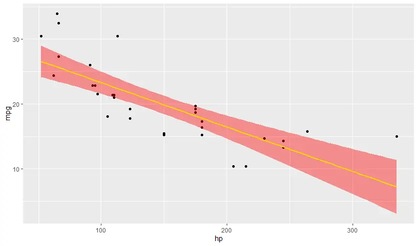
- geom_smooth
เพิ่ม regression line + standard error
# -->> se standard error
ggplot(mtcars, aes(hp,mpg)) +
  geom_point() +
  geom_smooth(method="lm", se = FALSE )

ggplot(mtcars, aes(hp,mpg)) +
  geom_point() +
  geom_smooth(method="lm", se = TRUE, color = "gold", fill = "red" )
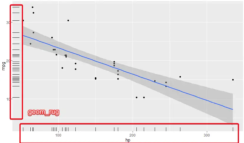
- geom_rug see density
# - geom_rug see density
ggplot(mtcars, aes(hp,mpg)) +
  geom_point() +
  geom_smooth(method="lm") +
  geom_rug()
- การนำเสนอ Theme หรือ ความสวยงามก็สำคัญ
สวยงามก็นิยามได้หลายแบบ ทั้งอ่านได้ ไม่ได้มีอะไรอัดกันมามากเกินไป รวมถึงการมีข้อมูลที่จำเป็นการการใช้งาน โดย Default ggplot2 มี theme_minimal() เอา backgroud ออกไป
แต่ถ้าเอาสวยงามมากกว่านี้ มีให้ลงปรับแต่กันจาก ggthemes
# theme_minimal remove bg

# want more theme https://cran.r-project.org/web/packages/ggthemes/index.html
# sample https://r-graph-gallery.com/package/ggthemes.html
install.packages('ggthemes')
library(ggthemes)

ggplot(data=small_diamonds,
       mapping = aes(x=price, y=carat)) +
  geom_point(mapping = aes(color = cut), alpha=0.50) +
  theme_economist()
เพิ่มข้อมูลประกอบ พวก Label ต่างๆ
ให้ Chart มีข้อมูล ที่ชัดเจน ทำยังให้ในเป้าหมาย ตีความได้ง่าย
# add chart name label > labs
ggplot(mtcars |> filter(hp < 250), aes(hp,mpg)) +
  geom_point() +
  geom_smooth(method="loess",
              se = TRUE,
              color = "gold",
              fill = "red" ) +
  labs(title = "Scatter Plot HP x MPG",
       subtitle = "Positive relationship between two variables",
       caption = "Data Source: mtcars data frame",
       x = "horse power",
       y = "mile per gallon")

# geom_point SE=False
ggplot(mtcars |> filter(hp < 250), aes(hp,mpg)) +
  geom_point() +
  geom_smooth(method="loess",
              se = F,
              color = "gold",
              fill = "red" ) +
  labs(title = "Scatter Plot HP x MPG",
       subtitle = "Positive relationship between two variables",
       caption = "Data Source: mtcars data frame",
       x = "horse power",
       y = "mile per gallon")
นอกจากรูปปลากรอบ (Chart) ต้องเพิ่มข้อมูล summary ประกอบด้วย
ถ้าย่อนกลับไปว่าทำไม่ต้องมี Data Viz เพราะข้อมูลมันหลอกกันได้ เลยมีการศึกษาขึ้นมา โดยศาสตร์นี้จะเรียกว่า Exploratory Data Analysis - มาจากคนนี้เลย John Tukey ทำให้เราเห็นภาพที่แตกต่าง โดยมี 2 มุม
- Numerical Method โดยการทำ summary stats / basic modeling
- Graphical Method - พวก Chart Data Visualization ใน Blog นี้ที่จดๆครับ
# Data Visualization (Graphical Method)
ggplot(data=diamonds,
       mapping = aes(x=price, y=carat)) +
  geom_point(mapping = aes(color = cut), alpha=0.50) +
  theme_economist()

# summary stats (Numerical Method)
summarise_diamonds <- diamonds |>
                        group_by(cut) |>
                        summarise(
                          n = n(),
                          avg_price = mean(price),
                          avg_carat = mean(carat)
                        )
- ถ้าอยากให้มัน Dynamic แบบ Google Sheet
อันนี้แอดทอย แนะนำว่ามีหลายตัว แต่บางตัวต้องเสียเงินนะ อาทิ เช่น
ployly sample ตัว ployly เวลาเราเอาเมาส์ไปจิ้มจุด มันจะแสดงข้อมูลละเอียดด้วย
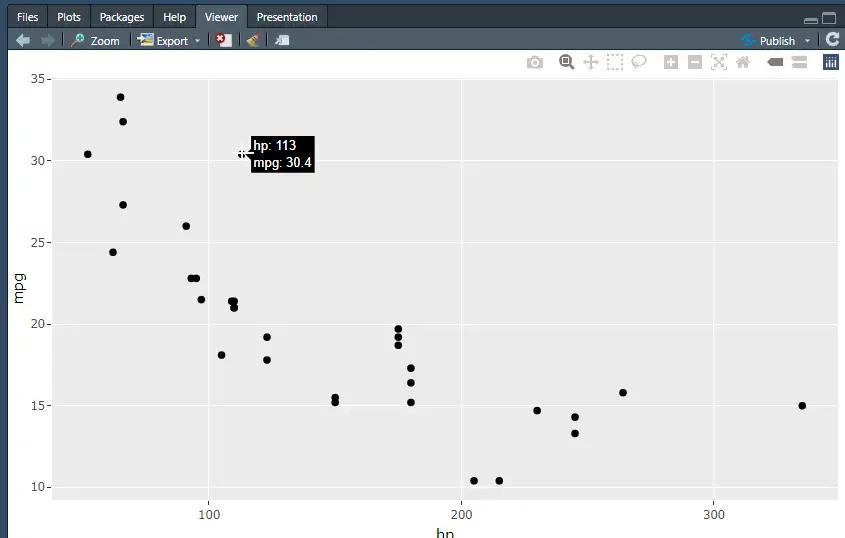
install.packages('plotly')
library(plotly)
plot1 <- ggplot(mtcars, aes(hp, mpg)) + geom_point()
ggplotly(plot1)
นอกจากมีที่ Note ใน Notion ด้วยแบบหยาบ Data Visualization in Google Sheets / Data Visualization in R
RMarkdown
ถ้าใช้เขียน Python มันจะมีแนวๆ Notebook เอกสาร + Code ที่ Run ได้ด้วย ตัว R เองก็มีเหมือนกัน โดยใน RStudio ลองใช้ได้ด้วย
- File > New File > R Markdown
- ตอนนี้จะได้เอกสารมาแล้ว ตามรูปเลย
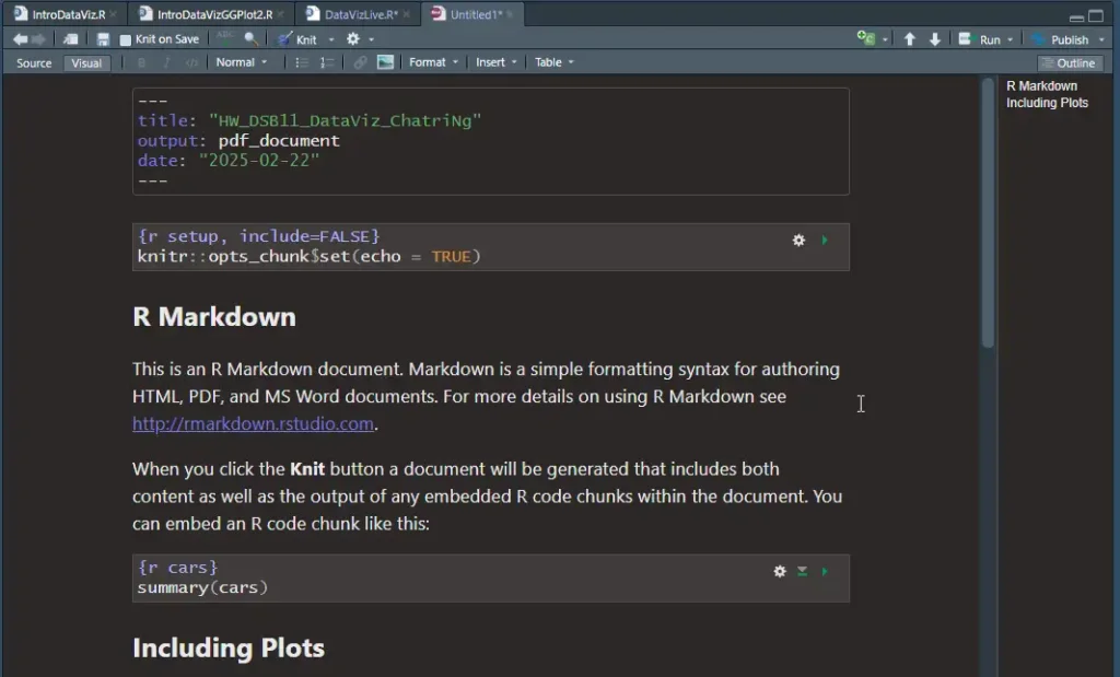
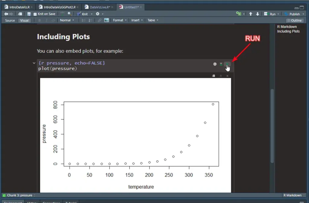
- ส่วน Code จะอยู่ใน
```มันมีหลายหมวด เข่น
# บอก Lib ว่าต้องลงอะไร

```{r setup, include=FALSE}
knitr::opts_chunk$set(echo = TRUE)
```

# เรียก Data Source เพื่อเอามาทำไรต่อ เช่น Chart

```{r cars}
summary(cars)
```
- เมื่อทำเสร็จ เราแชร์ไฟล์ markdown ไป หรือจะ Export PDF ก็ได้ แต่ RStudio (Desktop) ต้องลง Lib เพิ่ม เดี๋ยวผมแยกอีก Blog นะ
ดูความแน่นของเนื้อหาแล้ว กับกำหนดการเดือนหน้า จะตามเรียนย้อนหลังทันไหมนะ ยังไม่ทำการบ้าน 55
Discover more from naiwaen@DebuggingSoft
Subscribe to get the latest posts sent to your email.